Quantcast
Channel: ArchDaily Global
Viewing all 45937 articles
Browse latest View live

Tokyo Pop Lab Competition Winners Announced

$
0
0
By Stella Cinzia, Leonardo Ramondetti, Marco Lagamba & Francesco Montesoro. Image Courtesy of Bee Breeders By Stella Cinzia, Leonardo Ramondetti, Marco Lagamba & Francesco Montesoro. Image Courtesy of Bee Breeders

Detailed descriptions of the winning Bee BreedersTokyo Pop Lab proposals have been released. The competition brief called for a new program for studying and producing pop culture media in Tokyo. Drawing from a wide range of international pop culture history, entrants were encouraged to investigate the migration and evolution of pop culture across the world over time, and examine the relationship of culture and architecture. 

In challenging established typologies of pop culture, proposals exhibited a wide range of ideologies. Successful submissions were chosen for their nuanced depictions of pop culture, clear representation, and coherent agendas for the new laboratory's program.

Take a look at the winners of the Tokyo Pop Lab competition after the break.

By Stella Cinzia, Leonardo Ramondetti, Marco Lagamba & Francesco Montesoro. Image Courtesy of Bee Breeders By Stella Cinzia, Leonardo Ramondetti, Marco Lagamba & Francesco Montesoro. Image Courtesy of Bee Breeders By Alina Kvirkveliya & Sacha Gengler. Image Courtesy of Bee Breeders By Attilio de Palma, Andrea Longo & Enrico Nicli. Image Courtesy of Bee Breeders

First Prize: Attilio de Palma, Andrea Longo & Enrico Nicli / Italy

By Attilio de Palma, Andrea Longo & Enrico Nicli. Image Courtesy of Bee Breeders By Attilio de Palma, Andrea Longo & Enrico Nicli. Image Courtesy of Bee Breeders

The success of the first place proposal lies in its clarity of massing combined with a strong formal and conceptual position in response to the brief. The project consists of two large cubes placed in opposing corners of the site, lifted above the ground plane, and rejoined with an elevated walkway. One cube contains the mass media research component of the program and the other holds an undefined space of “manifesto” and experimentation, represented by an inflated red balloon waiting to pop. This cube is adorned with two-dimensional imagery in the form of full-height fabric tapestries, obscuring the container behind an ephemeral veil of fluctuating media. At grade, a concrete wall separates the sidewalk from a public courtyard/gallery and other public program. From the street this wall only allows views of the binary cubes, generating the sense of a separate and inner world.

Importantly, the project does not restrict pop culture to a particular form or a particular moment in time, but rather seeks to create a generic space and empty architecture, perpetually inflating with the exploration and representation of mass media and pop culture. The stripped-down but well-articulated construction of steel and concrete allows the project to successfully navigate the minefield of contemporary and traditional pop iconicity, deftly avoiding expected representational tools. Through its massing and tectonic assembly, the proposal takes a stance on the role, power, and ephemeral nature of the consumed image, keying in on the “manifesto” as the cultural appropriation and critique of the never-ending cycle of production and consumption.

By Attilio de Palma, Andrea Longo & Enrico Nicli. Image Courtesy of Bee Breeders By Attilio de Palma, Andrea Longo & Enrico Nicli. Image Courtesy of Bee Breeders By Attilio de Palma, Andrea Longo & Enrico Nicli. Image Courtesy of Bee Breeders By Attilio de Palma, Andrea Longo & Enrico Nicli. Image Courtesy of Bee Breeders

Second Prize: Stella Cinzia, Leonardo Ramondetti, Marco Lagamba & Francesco Montesoro / Italy

By Stella Cinzia, Leonardo Ramondetti, Marco Lagamba & Francesco Montesoro. Image Courtesy of Bee Breeders By Stella Cinzia, Leonardo Ramondetti, Marco Lagamba & Francesco Montesoro. Image Courtesy of Bee Breeders

The second place entry is distinguished through its definition and organization of public program and social activity. Diagrammatically, the project can be described as a civic pavilion, interrupted variously by hoisted volumes of discrete, localized activity. Below and in-between these floating volumes, urban life extends seamlessly into the building, perhaps resembling most closely the precedent of a colonnade or piazza. Through an open, and carefully considered plan, the scheme establishes an urban, public forum for popular culture.

The project uniquely inverts the traditional model of a contained exhibition space by distributing media throughout the primary public space — the circulation surrounding the differentiated volumes. Within each of the distributed volumes, academic functions including classrooms and a lecture hall, are contained. Rather than assume a singular or limited expression, the proposal establishes a forum to exhibit, celebrate, discuss, and debate, the ebb and flow of popular culture in its various forms of expression through thoughtful programming of public space.

By Stella Cinzia, Leonardo Ramondetti, Marco Lagamba & Francesco Montesoro. Image Courtesy of Bee Breeders By Stella Cinzia, Leonardo Ramondetti, Marco Lagamba & Francesco Montesoro. Image Courtesy of Bee Breeders By Stella Cinzia, Leonardo Ramondetti, Marco Lagamba & Francesco Montesoro. Image Courtesy of Bee Breeders By Stella Cinzia, Leonardo Ramondetti, Marco Lagamba & Francesco Montesoro. Image Courtesy of Bee Breeders

Third Prize: Alina Kvirkveliya & Sacha Gengler / Switzerland

By Alina Kvirkveliya & Sacha Gengler. Image Courtesy of Bee Breeders By Alina Kvirkveliya & Sacha Gengler. Image Courtesy of Bee Breeders

The chosen third place winner is notable for its clarity in thought and purpose. The project is organized around three conceptual and programmatic elements, including a distorted cube, an adjacent parterre replica from the Palace of Versailles, and a nested, infinite white void. Discrete yet cogent, the project oscillates between these elements, describing through architecture a critical, reflexive position of popular culture as a social phenomenon.

The project’s enclosure and signifying form is singular and definitive. A moderately inflated cube adorned by a glazed membrane produces a distorted reflection and interpretation of the building’s surroundings — of both the city, and local popular culture as it were. Occupying the other half of the site, the replicated Jardin de Versailles is overshadowed. Through juxtaposition, the inflated cube and Baroque replica provoke a striking statement concerning the contrast between popular and elitist culture — the former a phenomenological reflection of the immediate present, the latter a reference to historic propriety. The interior is anchored by an exhibition room, materialized as an infinite white void and described as a canvas for individual, cultural expression. Collectively, these three elements describe and thereby accommodate the dynamism of popular culture, a byproduct of social reflection, historic legacy, and individual expression.

By Alina Kvirkveliya & Sacha Gengler. Image Courtesy of Bee Breeders By Alina Kvirkveliya & Sacha Gengler. Image Courtesy of Bee Breeders By Alina Kvirkveliya & Sacha Gengler. Image Courtesy of Bee Breeders By Alina Kvirkveliya & Sacha Gengler. Image Courtesy of Bee Breeders

News via: Bee Breeders


The Key Architectural Elements Required to Design Yoga and Mediation Spaces

$
0
0
AYC / DX Arquitectos. Santiago de Chile. Image © Pablo Blanco AYC / DX Arquitectos. Santiago de Chile. Image © Pablo Blanco

For several decades, a set of oriental practices and techniques have strongly infiltrated the western world. A new program that, as architects, we must start solving more often, and that poses interesting challenges from the point of functional, environmental, and aesthetic.

These disciplines are completely focused on the human being, as they seek to work and satisfy their physical, psychological and spiritual needs, and that's why it seems important to analyze how these needs are being met spatially by architects. Many of the operations taken in these spaces create enabling environments for reflection, introspection, healing, and therefore could also be applied in other relevant programs, such as housing, educational, hospital, and even office spaces.

This article seeks to draw lessons from some projects already published on our site, in order to perform a kind of guide for designs that helps our community of readers to find inspiration more effectively.

Estudio Para Yoga-Kamadhenu / Carolina Echevarri + Alberto Burckhardt. Cundinamarca, Colombia. Image © Juan Cristobal Cobo AYC / DX Arquitectos. Santiago de Chile. Image © Pablo Blanco Centro Holístico Punto Zero / Dio Sustentable. Putaendo, Chile. Image © Jean Pierre Marchant y Fernando J. Romero Ritual House de Yoga / goCstudio. Seattle, Estados Unidos. Image © Kevin Scott

Spaces

Although each practice may require specific characteristics, most take place in a large open central space, accompanied by a set of support rooms.

Ritual House de Yoga / goCstudio. Seattle, Estados Unidos. Image © Kevin Scott Ritual House de Yoga / goCstudio. Seattle, Estados Unidos. Image © Kevin Scott

  • Main Room

This is the central space of the building where people gather for practice, and generally is a free plan, flexible and adaptable to different uses. To determine its dimensions, we can use the standard measures of a yoga mat, which unfolds fully stretched in an area of approximately 1.70 x 60 meters. It is suggested to leave at least 50 cm between the mats, to allow the free movement of users during the exercises.

Some of these rooms have a small platform or elevated area where the instructor or guide of the session is located, and it is good to add shelves or countertops where people can leave their 'tools' during the class (water bottles, towels, blankets, slippers). Usually, the room has mirrors on one or more walls, but this depends on the needs and the taste of the client.

YogaOne Mandri / Studio Shito. Barcelona, España YogaOne Mandri / Studio Shito. Barcelona, España
YogaOne Mandri / Studio Shito. Barcelona, España. Image © Marcela Grassi YogaOne Mandri / Studio Shito. Barcelona, España. Image © Marcela Grassi

We think about the architecture of the temples, in introverted and silent spaces, in places that look inward, of dim and changing light. (...) We think of the space we need to look at us inward.
DX Architects, about their project 'AYC' in Santiago de Chile

Ritual House de Yoga / goCstudio. Seattle, Estados Unidos Ritual House de Yoga / goCstudio. Seattle, Estados Unidos
Ritual House de Yoga / goCstudio. Seattle, Estados Unidos. Image © Kevin Scott Ritual House de Yoga / goCstudio. Seattle, Estados Unidos. Image © Kevin Scott

  • Bathrooms / Dressing Rooms

Not all centers include dressing rooms, but if there are resources and space, it is good to add. In the case adding them in, you can increase the size of the bathrooms allowing dual use. To achieve this objective and allow the space to be occupied by more than one person at a time, in several projects toilet area is separated from the sink, that is being associated with a kind of small dressing room, which may also include lockers, shelves, and benches.

Toilets should be located adjacent to the main room, with a quick and easy access from the main entrance area.

AYC / DX Arquitectos. Santiago de Chile AYC / DX Arquitectos. Santiago de Chile
AYC / DX Arquitectos. Santiago de Chile. Image © Pablo Blanco AYC / DX Arquitectos. Santiago de Chile. Image © Pablo Blanco

  • Circulations

Circulations gain great importance in this kind of projects, because not only can function as corridors or hallways, but also can contain storage spaces, waiting and resting areas, or even a reception. Some cases also take advantage of the walls to incorporate built-in shelves.

Yoga Deva / Blank Studio. Gilbert, Estados Unidos Yoga Deva / Blank Studio. Gilbert, Estados Unidos
YogaOne Mandri / Studio Shito. Barcelona, España. Image © Marcela Grassi YogaOne Mandri / Studio Shito. Barcelona, España. Image © Marcela Grassi

  • Others

Depending on the order received, the building may include several classrooms, plus massage cabins or jacuzzi, sauna and swimming pools areas. The height of the spaces is a choice of each client and architect, but the main room, at least, is designed in most cases with a greater height.

Centro Holístico Punto Zero / Dio Sustentable. Putaendo, Chile Centro Holístico Punto Zero / Dio Sustentable. Putaendo, Chile
Centro Holístico Punto Zero / Dio Sustentable. Putaendo, Chile. Image © Jean Pierre Marchant y Fernando J. Romero Centro Holístico Punto Zero / Dio Sustentable. Putaendo, Chile. Image © Jean Pierre Marchant y Fernando J. Romero

Environmental Conditions

  • Acoustics

There is a belief that these spaces must be completely silent, but precisely the idea of these disciplines is to be developed in spite of the ambient noise. In fact, in many cases, it is recommended to fully perform in exteriors, as many sounds of nature can help a better realization of different practices. In the case of closed rooms, these sounds (and even smells) can be integrated by incorporating indoor courtyards or gardens that attract birds, including moving water, and/or allow the flow of the wind.

Obviously, if a practice requires complete silence, the design must allow that the space can be completely isolated.

Spa Querétaro / Ambrosi I Etchegaray. Santiago de Querétaro, Mexico. Image © Luis Gordoa Spa Querétaro / Ambrosi I Etchegaray. Santiago de Querétaro, Mexico. Image © Luis Gordoa

The design premise was to create a center in constant contact with nature. For this we planned a flagstone garden around the property, with a set of perforations to create interior courtyards where gardens were generated. The spaces and their uses are constantly related through the courtyards and gardens.
Ambrosi I Etchegaray, about their project Spa Querétaro in Querétaro, México

  • Ventilation

This is a fundamental issue in these practices, since they all use breath as the basis for its development. It is important to allow cross ventilation across the room, making sure that there is a certain current renew of oxygen inside, during the session or at the times when the room is not being occupied. For this, we should generate a first opening in the facade that receives the prevailing winds, and a second opening (preferably bigger) on the opposite wall.

Meditation Pavilion & Garden / GMAA. Geneva, Suiza. Image © A.Korour Meditation Pavilion & Garden / GMAA. Geneva, Suiza. Image © A.Korour

  • Ilumination

The light allows to qualify environmentally the space and can help to lead the intension of the practice being done. In the case of Yoga, direct connection to the sun is essential in many of their exercises. That's why we should always favor natural lighting, and is necessary, to incorporate systems to regulate their intensity, allowing darken the room completely if necessary.

AYC / DX Arquitectos. Santiago de Chile. Image © Pablo Blanco AYC / DX Arquitectos. Santiago de Chile. Image © Pablo Blanco

In order to avoid glare, in most of the projects presented in this article, light does not fall directly on people, and have been used zenithal openings, windows at floor level, fuzzy screens, and light courtyard surrounding the main room.

If practices are carried out at night, artificial lighting choice should be warm and also adjustable.

Estudio Para Yoga-Kamadhenu / Carolina Echevarri + Alberto Burckhardt. Cundinamarca, Colombia. Image © Juan Cristobal Cobo Estudio Para Yoga-Kamadhenu / Carolina Echevarri + Alberto Burckhardt. Cundinamarca, Colombia. Image © Juan Cristobal Cobo

The construction is transformed with light changes, thus achieving a balance with its natural surroundings, which is transmitted into their spaces and therefore to project users.
Carolina Echevarri + Alberto Burckhardt, about their project 'Yoga-Kamadhemy' in Cundinamarca, Colombia

  • Aesthetics and Materials

The aesthetics of space depends entirely on the client requirement, but generally, you should avoid distracting elements or exaggerated decorations. It is recommended using warm materials and soft colors (or directly white) to help attendees achieve a certain degree of initial concentration. As practices carried out in permanent contact with the ground, floors are usually covered with wood or materials rather 'soft' and warm to the touch.

YogaOne Mandri / Studio Shito. Barcelona, España. Image © Marcela Grassi YogaOne Mandri / Studio Shito. Barcelona, España. Image © Marcela Grassi

The aim of the project is the creation of spaces where materials, furniture, lighting and colors accompany yoga practice, creating a smooth transition in the path. It is relaxed and limited spaces that allow the user to stop their busy lifestyle and connecting slowly, with body and a serene mental space.
Studio Shito about their project 'YogaOne Mandri' in Barcelona, España

  • Orientation and Geometry

Some of the projects are based spatially and geometrically in the traditional tenets of the different practices, as many claim that certain orientations and configurations may enhance the effectiveness of the exercises.

Centro Holístico Punto Zero / Dio Sustentable. Putaendo, Chile. Image © Jean Pierre Marchant y Fernando J. Romero Centro Holístico Punto Zero / Dio Sustentable. Putaendo, Chile. Image © Jean Pierre Marchant y Fernando J. Romero

For example, we talk about some beneficial cardinal directions, like the East (where would travel certain subtle energies accompanying the movement of the Earth) or Magnetic North (near the geographic North, which would allow us to align with the magnetic field of our planet). Other cases have based their design in the studio of the sacred geometries, and have even made dowsing ground surveys to learn of benign energies present at the project site.

Centro Holístico Punto Zero / Dio Sustentable. Putaendo, Chile Centro Holístico Punto Zero / Dio Sustentable. Putaendo, Chile

These organic references allow us to drop some stiffness of a more practical design, moving to generate curves or circular shapes that could impact positively on the user experience inside of the building.

Have you designed one of these spaces, or do you perform one of these practices often?

Ritual House of Yoga / goCstudio

AYC / DX Arquitectos

Spa Querétaro / Ambrosi I Etchegaray

Kamadhenu Yoga Studio / Carolina Echevarri + Alberto Burckhardt

Yoga Deva / Blank Studio

Meditation Pavilion & Garden / GMAA

Building O / META Architectuurbureau

$
0
0
© Filip Dujardin      © Filip Dujardin

© Filip Dujardin      © Filip Dujardin      © Filip Dujardin      © Filip Dujardin

  • Architects: META Architectuurbureau
  • Location: Universiteitsplein 1, 2610 Antwerpen, Belgium
  • Architects In Charge: Niklaas Deboutte, Eric Soors
  • Area: 8520.0 sqm
  • Project Year: 2016
  • Photographs: Filip Dujardin
  • Client: University Of Antwerp
  • Meta Project Leader: Frederik Bogaerts
  • Meta Project Staff: Stijn Elsen, Simone Valerio, Rob Wesselink
  • Stability, Technology, Epb Reporting, Acoustics: Tractebel

  • Project Management Board Tractebel: Marc De Smet
  • Project Manager Tractebel: Veerle Van Geldre
  • Project Staff Tractebel: Jeroen De Wael, Kevin Morlion, Ive De Maeseneire, Magda Morel, Hinde El Kassmi, Marjolein Vandersickel
  • Art Integration: Perry Roberts

  • Collaboration: Storimans Wijffels Architecten
  • Landscape Design: Urban Design & Landscape Architecture West 8
  • Safety Coordinator: François Jordaens (Ua)
  • Main Contractor: Thv Atro Cfe
© Filip Dujardin      © Filip Dujardin

From the architect. Building O by META strengthens the heart of the UA-campus in Antwerp. META and TRACTEBEL with Storimans Wijffels architects completed for the University of Antwerp an auditorium and research building. Building O houses 3 faculties.

© Filip Dujardin      © Filip Dujardin

“By paying special attention to the structure, we were able to dispense with several layers of finishing. The result is a solid, student-resistant construction.” [ Niklaas Deboutte, META architectuurbureau ]


“Building O is a bright and compact volume, an eye catcher for the campus but with the smallest possible spatial stamp.” [ Eric Soors, META architectuurbureau ]

© Filip Dujardin      © Filip Dujardin

Mirror symmetry in a readable building 
Building O is a bright and compact volume that, on the one hand, is intended to be an eye-catcher on the campus. On the other hand, it was also required to leave the smallest possible spatial stamp on the site. 
The balance between affirmation and integration, and the unifying role of Building O, resulted in a universal building with a double entrance section that is mirrored diagonally. The four auditoria on each of levels -1 and +1 are arranged around the central atrium, the large skylight of which permits zenithal daylight to penetrate to the underground level. The ground floor accommodates shared functions and the large entrance-cum-meeting rooms. Four compact stairwells lead off from this area. The upper level (+3) is reserved for the laboratory and microscopy rooms.

Plan 0 Plan 0

Maximum light ingress with floating volume clad 
in golden perforated aluminium sheets
By positioning the ground-floor facade inwards to a depth of 1 module META creates a covered interior circuit. The floating volume is enveloped in golden perforated aluminium plates that function as fixed blinds. These allow a soft filtered light to permeate the building while also permitting views outside. The panels on the 3rd floor can be opened to allow maximum light into the practice spaces. Using the same material for both the façade and ceiling of the interior circuit, as well as the foyers, gives rise to a floating volume that, in the diffuse evening light, reveals a glimpse of its inner life to passers-by. 

Prominent role for art with artist Perry Roberts
Art was integrated through the work of Perry Roberts (UK). A photograph of students and teachers was punched into the golden aluminium facade panels. A reference to traditional class photographs, the image was rasterized into dots with 5 different diameters. When viewed close-up, the image appears to be abstract, but becomes readable at a greater remove. 

© Filip Dujardin      © Filip Dujardin

Structural work is finishing work
META also deployed the ‘structural work is finishing work’ principle. By paying special attention to the basic structure, it was possible to dispense with several layers of finishing. The end result is a solid, student-resistant construction.

Plan 1 Plan 1

Durable shell
The University Antwerp attaches great importance to a reliable and well-insulated exterior shell. The compact nature of the volume and use of multiple layers of suitable insulation enabled us to obtain low U-values that resulted in a very favourable K16.

© Filip Dujardin      © Filip Dujardin

Product Description. The floating volume is enveloped in golden perforated aluminium plates that function as fixed blinds for the auditoriums, microscopy and laboratory rooms. These allow a soft filtered light to permeate the building while also permitting views outside. The panels on the 3rd floor can be opened to allow maximum light into the practice spaces. Using the same material for both the façade and ceiling of the interior circuit, as well as the foyers, gives rise to a floating volume.

© Filip Dujardin      © Filip Dujardin

Architecture Marketing 101: How Basic Concepts Can Help Your Practice

$
0
0

This article was originally published by Archipreneur as "How to Grow Your Architecture Firm Through Marketing."

Marketing is not simply an expense reserved for already established architecture firms. Small businesses in particular can benefit from a smart marketing strategy by aligning their operations with some of marketing’s most basic premises and concepts.

Architects in general have a tendency to underestimate the importance of marketing in creating and running a successful business. Even those who claim to understand the role of marketing in acquiring clients and building relationships often fail to fully utilize its potential. Principals of small architecture firms often get caught up in trying to keep their practices afloat and end up treating marketing as a luxury that they will be able to afford once they achieve stability--thus missing the true role of marketing as being a catalyst for growth. Architects need to apply marketing to their practices from the onset and treat it with the same amount of dedication as they do with their floor plans, sections and 3D models of their building designs.

Marketing is a complex discipline, but its fundamentals can be broken down to a few simple concepts. As long as you keep these in mind at all times, your marketing efforts will be more successful, and easy to analyze and adjust. You need to be able to answer these three relatively easy questions and communicate them effectively to your audience:

Who are You?

In order to define your place in the industry and your target demographic, you need to determine who you are and what you do. Vague phrases about quality services, multidisciplinarity and “cutting-edge design” on your About Us page will not provide any useful information on what your company actually does. What do you stand for? How is this vision reflected in your office culture, design, and the type of projects you take on?

What Need Do You Fulfill?

Answering this requires you to formulate a value proposition. A value proposition explains how your service or product can help to solve your client’s problem and must be formulated in a concise and clear way, showing concrete results where possible. Even if you offer great value, if you fail to communicate it, your business will not attract new clients.

How are You Different?

Being able to differentiate yourself from your competition is a huge advantage. This is not easy, but your efforts have to go beyond mere sound bites. It can be achieved either by simply offering services in a more organized, client-oriented and reliable way, or by creating a unique, game-changing product or service.

Once you can answer these three questions, your marketing efforts basically filter into four-step process:

  1. Attracting potential clients
  2. Converting visitors to leads
  3. Closing the deal
  4. Cultivating relationships

These steps may seem straightforward, but there are several schools of thought on how to apply them. With the recent widespread adoption of social media and online tools, marketing has expanded to exciting new ways that architects can engage with and build an audience, and then successfully convert them to leads.

Today’s users have much more control of their media, and this has leveled the “marketing playfield” by offering businesses the opportunity to organically reach audiences by using relatively affordable channels and winning them over with engaging content. This phenomenon has introduced the concept of  “inbound marketing,” which contrasts with the traditional “outbound marketing” in almost every significant way.

Before coming to a verdict as to which is better, let’s see what each entails:

Outbound Marketing

Outbound marketing includes traditional advertising practices, cold calling, email and newsletter blasts, sponsorship, and word-of-mouth referrals, to name a few. It is generally known as an interruptive marketing practice that has become less effective in the last few decades. Spam protection tools and blocking techniques, along with the development of new communication trends through social media, have empowered users and limited many of the elements of outbound marketing.

Inbound Marketing

Inbound marketing embraces new media tools, and promotes creating and sharing content that appeals to specific demographics. Publishing the right content at the right moment is at the core of inbound marketing. It focuses on building communities and relies on organic search traffic. It uses blogs, social media, calls-to-action and landing pages to convert visitors to leads.

Data is also an important element of inbound marketing as it uses surveys and social monitoring to find out where your target audiences are and what they want.

***

Most architecture firms will not have to choose between inbound and outbound marketing. Despite hyperbole from proponents of both concepts, they actually work best in combination. You will probably need to keep sending out newsletters and press releases, publishing in magazines, and attending seminars and conferences. However, inbound marketing will allow you to track your return on investment (ROI) more easily, and thus build your reputation. Just remember, there is no single marketing solution that works for everyone.

To learn more about how some of the leading architecture firms use social media, networking, blogging and other marketing tools, check out Archipreneur’s book on new business models for architects“The Archipreneur Concept”.

MAD Architects Unveils Design for Translucent China Philharmonic Hall in Beijing

$
0
0
Exterior View. Image Courtesy of MAD Architects Exterior View. Image Courtesy of MAD Architects

MAD Architects has unveiled the design of the new China Philharmonic Hall in Beijing. Conceived in collaboration with renowned acoustic expert Yasuhisa Toyota (Walt Disney Concert Hall, Philharmonie de Paris, Suntory Hall, etc.), the concert hall will serve as the China Philharmonic Orchestra’s first permanent residency while becoming “a cultural exchange and China’s new locus for classical music.”

To be located at the south side of the Workers Stadium East Gate in Beijing’s Central Business District, the 26,587 square meter (286,000 square foot) building has been envisioned as a “hidden gem” and a place of peaceful respite within the city.

“We wanted to create a pure and sacred oasis in the midst of the bustling city,” says Ma Yansong, founder & principal partner of MAD Architects. “From the moment you enter the building, you will be taken to another time and space.”

Bird's Eye View. Image Courtesy of MAD Architects Lobby. Image Courtesy of MAD Architects Main Concert Hall. Image Courtesy of MAD Architects Philharmonic Hall diagram. Image Courtesy of MAD Architects

Bird's Eye View. Image Courtesy of MAD Architects Bird's Eye View. Image Courtesy of MAD Architects

Surrounded by a lotus pond and lush greenery, the building’s draped, translucent façade lifts at the entrances to invite in visitors. Once inside, the soaring lobby will provide access to the two performance halls and serve as an area for mingling within the soft light.

“Audiences will experience a transition from an urban setting to one of music and nature, preparing them for a journey of self-discovery,” says Ma Yansong.

Lotus Pond View. Image Courtesy of MAD Architects Lotus Pond View. Image Courtesy of MAD Architects
Lobby. Image Courtesy of MAD Architects Lobby. Image Courtesy of MAD Architects

The design of the 1,600-seat main concert hall draws inspiration from the natural, with “vineyard style” seating rising around the stage in a series of sloping terraces and white sound reflection petals on the ceiling will take the form of segments of a lotus flower. During the day, natural light will filter through the ceiling elements, while at night, lighting and visualizations can be projects onto the interior surfaces to create natural scenes that harmonize with the musical performances.

Main Concert Hall. Image Courtesy of MAD Architects Main Concert Hall. Image Courtesy of MAD Architects

On the south side of the building, a 400-seat rehearsal hall will be nestled within curved wooden walls. An adjustable sound reflection panel at the back of the stage can be configured for different performance types; in its most dramatic arrangement, it can be raised to allow the natural lotus pond outside to serve as the backdrop for the performance.

Small Concert Hall. Image Courtesy of MAD Architects Small Concert Hall. Image Courtesy of MAD Architects
Cafe. Image Courtesy of MAD Architects Cafe. Image Courtesy of MAD Architects
Lobby. Image Courtesy of MAD Architects Lobby. Image Courtesy of MAD Architects

The building will also contain professional recording studio, a library, a collection gallery, offices, rehearsal rooms, and other auxiliary function spaces. MAD Architects hopes the design will become “a new formula for concert hall design and introduce a space within the busy city that promotes conversations between people, nature, and music.”

Construction on the China Philharmonic Hall will begin later this year, and is expected to be completed in 2019.

Philharmonic Hall diagram. Image Courtesy of MAD Architects Philharmonic Hall diagram. Image Courtesy of MAD Architects
Rehearsal Room. Image Courtesy of MAD Architects Rehearsal Room. Image Courtesy of MAD Architects
Model. Image Courtesy of MAD Architects Model. Image Courtesy of MAD Architects
Exterior View. Image Courtesy of MAD Architects Exterior View. Image Courtesy of MAD Architects

News via MAD Architects.

  • Architects: MAD Architects
  • Location: Beijing, China
  • Architect: MAD Architects
  • Directors: Ma Yansong, Dang Qun, Yosuke Hayano
  • Design Team: Kin Li, Liu Huiying, Fu Xiaoyi, Brecht Van Acker, Zeng Hao, Li Guangchong, Jacob Hu, Xiao Ying, Dora Lam, Zhao Wei, Shen Chen, Dmitry Seregin, Zhu Jinglu, Yukan Yanagawa, Wang Deyuan, Hiroki Fujino, Zheng Fang, Sear Nee
  • Client: China Philharmonic Orchestra
  • Interior Design: MAD Architects
  • Acoustics: Nagata Acoustics
  • Construction Engineer: Radio Film & Television Design & Research Institute (DRFT)
  • Structural Consultant: China Construction International (Shenzhen) Design Consultant Co., Ltd.
  • Façade Consultant: RFR Asia
  • Lighting Consultant: SIGN Lighting
  • Interior Executive Architect: Beijing Honggao Interior Design Co., Ltd.
  • Landscape Design: Palm Design Co., Ltd.
  • Planning Of Traffic Facilities: Beijing Homedale Institute of Urban Planning & Architectural Design
  • Type: Concert Hall
  • Status: Design development
  • Building Height: 24m (79ft)
  • Main Concert Hall Capacity: 1600
  • Area: 11600.0 sqm
  • Project Year: 2019
  • Photographs: Courtesy of MAD Architects

ESPAÑA8477 / Diseño Norteño

$
0
0
© Lorena Darquea © Lorena Darquea

© Lorena Darquea © Lorena Darquea © Lorena Darquea © Lorena Darquea

  • Collaborators: Mauricio Kuri, Oscar González, Manuel Álvarez, Marco Montaño
  • Construction: Luvier Ingeniería
© Lorena Darquea © Lorena Darquea

The project España 8477 is generated when searching for a typology for a small-scale vertical housing building, where all users can enjoy a different spatial quality and at an affordable price. The multifamily building that is common in the city is a repetition of a typical plan for 'n' number of levels. Where outdoor spaces are limited to the access corridors or stairs and inside the views are determined by the height of the building.

© Lorena Darquea © Lorena Darquea

This building has 10 housing units, with a flexible distribution inside, 80 to 90 m2, with 1 and 2-level units due to the composition of the structural design.

© Lorena Darquea © Lorena Darquea

Two main volumes linked by their circulations are mounted on the exposed metal structure. The variation of the plans generates very large outdoor spaces. Each unit can double the size of the social area when opening sliding doors, creating an indoor-outdoor environment, taking advantage of the best views of the neighborhood, without relying on them. The atmosphere of each unit changes according to their orientation and relationship with their terrace, allowing each one to have a different atmosphere. The gaps between volumes function as light cubes that light up the lower floors, allowing the building to ventilate naturally through all of its facades.

© Lorena Darquea © Lorena Darquea
Plan Plan
© Lorena Darquea © Lorena Darquea

The 2-level units allow access to the apartments in the first four of five levels, freeing the building from depending on an elevator. The scale of the construction remains friendly to pedestrians and respects the existing urban scale, which we consider very important in the neighborhood.

Section Section

Ansarada Chicago Office / Those Architects

$
0
0
© Luc Remond © Luc Remond

© Luc Remond © Luc Remond © Luc Remond © Luc Remond

  • Architects: Those Architects
  • Location: Chicago, IL, United States
  • Design Team: Ben Mitchell (project director), Simon Addinall (project architect), Karoline De Mendonça, Luke Hallaways
  • Area: 880.0 sqm
  • Project Year: 2016
  • Photographs: Luc Remond
  • Builder: Knudsen Construction Inc
  • Millwork: Siebert Millwork Inc
  • Client: Ansarada
© Luc Remond © Luc Remond

From the architect. Perhaps the last thing you would expect to encounter on entering a financial services workspace is a luxurious ‘collaboration room’ with woollen sphere seats, more akin to a fine art installation than a meeting room. Certainly not then, a full scale baseball batting cage complete with pitching machine – a nod to the projects location in Chicago, Illinois, USA.

© Luc Remond © Luc Remond

Both are part of a sophisticated new office fit-out for the Sydney based global financial services company with which THOSE Architects have a long standing relationship, having delivered their multi award winning and widely published headquarters in Sydney, Australia.

© Luc Remond © Luc Remond

“We deal in a virtual, data-driven world but our most valuable asset is the people behind the scenes”, says Ansarada CEO Sam Riley. “We aim to simplify, not complicate, not just in our product interface but for our clients, and the way we work as a team. So we wanted our office to be a truly wonderful space. Serious and at the same time, playful, simple and sophisticated, fresh yet experienced, authentic and contemporary. Our workplace should reflect these values, and make a positive difference to our lives, and to our clients lives. THOSE Architects fit-out does all of those things for us”.

© Luc Remond © Luc Remond

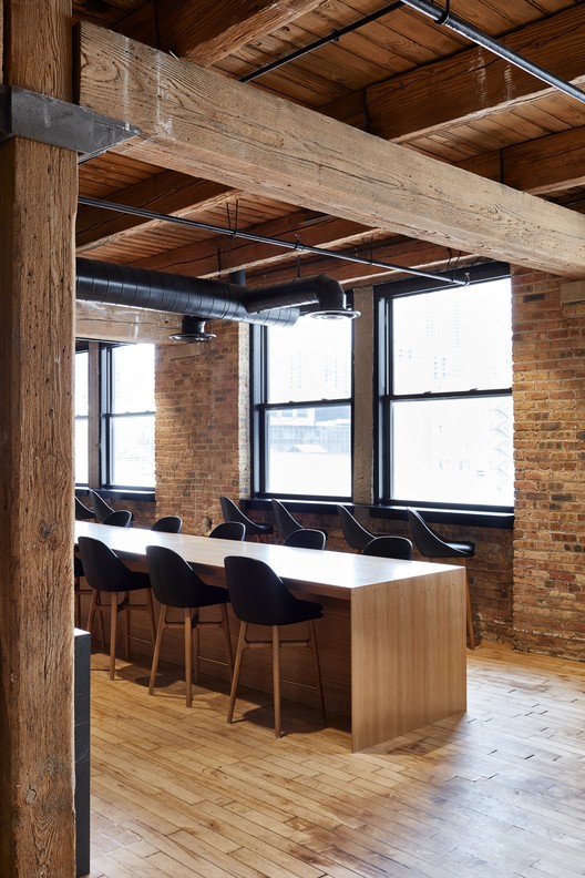
The 880 sqm (9500 sqft) project is located in Chicago’s river north district, a stylish urban neighbourhood bordering the magnificent mile. The office occupies the entire fifth floor of a grand old warehouse richly textured with hand pressed bricks, douglas fir posts and beams, finely detailed windows and hardwood floors and ceilings.

Floor Plan Floor Plan

As the building was not heritage listed by the City of Chicago, nor the state of Illinois, THOSE Architects were able to take a more aggressive architectural approach to the fit-out than was possible in the heritage-sensitive Sydney project. “While remaining respectful to the grand old lady we inherited, we were able to insert some substantial architectural elements into the space to enable us to better establish functional zones throughout this project” says THOSE Architects director Ben Mitchell.

© Luc Remond © Luc Remond

The Chicago space functions primarily as a marketing, sales and client services office which to a large extent dictated the performance brief to THOSE Architects. “It is a simple concept, but we had to ensure the space functioned acoustically and aesthetically to reflect the brand’s mantra of sophisticated simplicity while seamlessly integrating a great deal of technological infrastructure to allow the staff to perform at their best”. Ben says.

© Luc Remond © Luc Remond

The project’s main move was to insert a bold black plywood box down the centre of the space in order to clearly define the three zones of the office. The main utility functions are carried out in this zone with provision of a kitchen, mud room, shower room, laundry and storage facilities. Also covertly located in this architectural element are a collaboration space and reading room, both of which gain considerable acoustic and visual privacy as a result of this location. Not only does the central black plywood box provide the main architectural element in the space, it is detailed with hundreds of thousands of peg holes that enable the staff to utilise the entire surface in myriad of ways. Brushed solid brass pegs sleeve perfectly into the peg holes and are used for anything from writing your colleague a message to hanging a coat.

© Luc Remond © Luc Remond

The recreation and informal meeting rooms are located kitchen-side of the black box with a jaw dropping view over the Chicago skyline. This zone features the entry reception complete with custom detailed couches and light fixture, staff breakout area featuring custom soft furnishings, dining zone, gaming area and ultra refined meeting rooms.

© Luc Remond © Luc Remond

Far-side of the black box, the workstations are accommodated and feature soft grey woollen carpets and ceiling panels with intricate brass and timber detailing. Secret doors abound throughout the space, concealing everything from storage to a full scale library.

© Luc Remond © Luc Remond

Four years on from the inaugural Sydney fit-out, Ansarada has matured as a company which is reflected in the architecture of the Chicago project. THOSE Architects have retained the playful essence of the Australian philosophy, however have imbued this project with a layer of sophistication rarely seen in the corporate workplace.

© Luc Remond © Luc Remond

New York's Future Second Tallest Tower Breaks Ground

$
0
0

The Kohn Pedersen Fox-designed One Vanderbilt Avenue broke ground today, beginning construction on what will stand as the second tallest tower in New York City upon completion. Located adjacent to Grand Central Terminal on 42nd Street, the tower will be integrated into the its neighbor through a series of underground connections and $220 million in improvements to Grand Central’s infrastructure.

Courtesy of SL Green Realty Corp Courtesy of SL Green Realty Corp Courtesy of SL Green Realty Corp Courtesy of SL Green Realty Corp

Courtesy of SL Green Realty Corp Courtesy of SL Green Realty Corp

Developed by SL Green Realty Corp, One Vanderbilt will encompass an entire city block between Madison and Vanderbilt Avenues and will rise to a pinnacle at 1,401 feet, five feet taller than the city’s current second tallest building, 432 Park Avenue. At the building base along 42nd Street, the facade will be pulled back at an angle to reveal Grand Central’s majestic Vanderbilt cornice, which had been obscured for nearly a century.

Courtesy of SL Green Realty Corp Courtesy of SL Green Realty Corp

The tower will contain 1.7 million square feet of office space on 58 column-free floors that feature fully glazed walls and higher than standard ceiling heights, while a 30,000 square-foot amenity floor will feature world-class dining. The building is expected to obtain the highest possible LEED certification.

Courtesy of SL Green Realty Corp Courtesy of SL Green Realty Corp

“One Vanderbilt will not only emerge as an elegant, tapered new icon on the New York skyline, but will also serve as a leading example of a global trend of connecting train stations to tall towers, said James von Klemperer, FAIA, RIBA, President of Kohn Pedersen Fox Associates.

“This building will change its neighborhood for the better. It will provide a new gateway to the city made possible only through the unusually harmonious partnership between architect, developer, and the City of New York.”

Courtesy of SL Green Realty Corp Courtesy of SL Green Realty Corp

Included in SL Green’s $220 million public infrastructure upgrades will be a new “jewel box” transit hall in the base of One Vanderbilt, a public plaza on Vanderbilt Avenue, and improved circulation into the Grand Central Terminal complex.

Construction will be managed by Tishman Construction, and is expected to be completed in 2020.

News via SL Green.


Tangram / Architecten de Vylder Vinck Taillieu

$
0
0
© Filip Dujardin    © Filip Dujardin

© Filip Dujardin    © Filip Dujardin    © Filip Dujardin    © Filip Dujardin

© Filip Dujardin    © Filip Dujardin

A sharp line makes two houses out of one. A sharp line makes one house out of two houses. One of those houses will be dealt with. The other will not – not really. One of the houses will become a shop. The other will not. The other will become not a store.

© Filip Dujardin    © Filip Dujardin

But together one house.

Two houses which together form one will look towards each other through that sharp line. The sharp line will be a wall of glass. Along the wall visitors will walk into one of the houses to the back. On the other side visitors will walk through the shop to the front. Or to the back again.

© Filip Dujardin    © Filip Dujardin
Plan Plan
© Filip Dujardin    © Filip Dujardin

A long shop – along the shop. Following the sharp line that is a wall of glass. From front façade to garden at the back.

© Filip Dujardin    © Filip Dujardin

The garden at the back is just so a house. Half of a house, without a roof. An old stable. A new garden.

Section Section

And upstairs. Another house. Behind the front face. Just so a house, to live in.

© Filip Dujardin    © Filip Dujardin

How many houses can a house be?
While being a shop as well. A walk through the house as shop. 

Agence d’Architecture A. Bechu & Associés Wins Competition for New University Campus in Moroccan Oceanside Town

$
0
0
Courtesy of Agence d’Architecture A. Bechu & Associés Courtesy of Agence d’Architecture A. Bechu & Associés

Agence d’Architecture A. Bechu & Associés has won a competition to design a new campus for the University of Laâyoune to be located in the oceanside town of Foum el Oued, Morocco (Western Sahara). Launched by King Mohammed VI last February, the competition was named a national priority project supported by Office Chérifien des Phosphates (OCP), a Moroccan company and the world’s leading producer of phosphate. The project was aimed at contributing to the economic and social boom of the region by creating a new platform for innovation and research & development.

Courtesy of Agence d’Architecture A. Bechu & Associés Courtesy of Agence d’Architecture A. Bechu & Associés Courtesy of Agence d’Architecture A. Bechu & Associés Courtesy of Agence d’Architecture A. Bechu & Associés

Courtesy of Agence d’Architecture A. Bechu & Associés Courtesy of Agence d’Architecture A. Bechu & Associés

AAAB & Associés’ design responds to this call by envisioning a campus integrated with the natural desert site to create a dialogue between building and its environment. Responding to the local climate, and taking inspiration from the lines of nearby sand dunes, the buildings come together via a central, canopied artery that creates shaded, public space for meeting and interaction. This interior street takes the form of a large crack in the dried desert earth, but will instead be filled with vegetation to contribute to cooling and atmosphere.

Courtesy of Agence d’Architecture A. Bechu & Associés Courtesy of Agence d’Architecture A. Bechu & Associés

The campus will also follow the dual objectives given by the OCP. First, to make the University of Laayoune a ground for experimental teaching methods in fields such as water, energy and desert agriculture through the installation of living laboratories dedicated to new environmental technologies and biomimicry; and secondly, to develop a building capable of exemplary energetic passivity.

Courtesy of Agence d’Architecture A. Bechu & Associés Courtesy of Agence d’Architecture A. Bechu & Associés

Teaming with structural engineers DVVD, environmental consultant Ennesys and planning consultants EMBIX, the architects developed a sustainable strategy that will allow the campus to obtain 80% of its energy from passive sources, as well as recycle dust, water and organic waste into reusable water and high-value bio fertilizer. The approach will mix traditional and modern technologies to create an intelligent grid inspired by the local environment. These techniques will allow the complex to approximate zero-waste metrics.

Courtesy of Agence d’Architecture A. Bechu & Associés Courtesy of Agence d’Architecture A. Bechu & Associés

The project hopes to set an example of how to design sustainable cities in the harsh African desert – by 2050, the African population is predicted to double to 2.5 billion inhabitants, for whom new architecture will need to be developed to accommodate.

The University of Laâyoune will be completed in 2018 and will hold its grand opening in September of that year.

News via Agence d’Architecture A. Bechu & Associés.

Courtesy of Agence d’Architecture A. Bechu & Associés Courtesy of Agence d’Architecture A. Bechu & Associés
  • Architects: Agence d’Architecture A. Bechu & Associés
  • Location: Foum el-Oued, Morocco
  • Architect: AgenceArchitecture A. Bechu & Associés
  • Client: OCP
  • Associate Architect: Benounna
  • Structural Engineer: DVVD
  • Environmental Consultant: Ennesys
  • Planning Consultatn: EMBIX
  • Area: 100000.0 sqm
  • Project Year: 2016
  • Photographs: Courtesy of Agence d’Architecture A. Bechu & Associés

Chaimiduo Farm Restaurant and Bazaar / Zhaoyang Architects

$
0
0
© Pengfei Wang © Pengfei Wang

© Pengfei Wang © Pengfei Wang © Pengfei Wang © Pengfei Wang

  • Architects: Zhaoyang Architects
  • Location: Dali, Yunnan, China
  • Design Team: Yang Zhao, Peigen Shang
  • Interior Designer For The Restaurant:: XuCai
  • Area: 631.0 sqm
  • Project Year: 2015
  • Photographs: Pengfei Wang
  • Client: Chaimiduo Team
© Pengfei Wang © Pengfei Wang

From the architect. This is a renovation project. The property was originally an abandoned office facility located at the center of Dali old town, including a traditional Bai style timber building, a bungalow made of brick and concrete and a 200 sqm courtyard. The property has been rented by a local lifestyle brand “Chaimiduo” and renovated into a farm restaurant, a farmer’s supermarket, a gallery for local handicraft and space for “Chaimiduo Bazaar” that opens once a week. 

Axnometrical drawing with program arrangement Axnometrical drawing with program arrangement

The idea of the renovation is mainly about redefining the courtyard’s four different sides using ad-hoc strategies. A second floor is added to the bungalow at the north side of the courtyard, with a traditional Bai style tiled roof (responding to the design code of Dali old town). An irregular shaped steel pavilion extrudes into the courtyard, connecting the restaurant interior with the courtyard space. The pavilion is wrapped with bamboo to emphasize its volume and to filter sunlight for its interior. The bamboo façade is operable towards the courtyard, allowing more interaction during bazaar hours. The bamboo facade also extends upward and becomes the banister for the terrace. The profile of the banister is tilted, directing the spatial orientation towards the preserved upper floor facade and tiled roof of the neighboring timber building.

© Pengfei Wang © Pengfei Wang

The timber building was constructed according to traditional methods. We demolished the partition wall on the ground floor and also the timber doors with wood lattice. The space of the ground floor therefore opens up to the outside. We also added to the facade a system of bamboo sliding doors and then the openness can be adjusted. The bamboo system hides the original timber columns and introduces a new appearance responding to the transformed open spatiality. While canceling the reading of the traditional image on the ground floor, this new façade also highlights the more refined details of the preserved facade of the upper floor and tiled roof. 

© Pengfei Wang © Pengfei Wang

The southern side of the courtyard is the main entrance to the whole property. We added a wedge shaped pavilion to redefine the entrance space. It provides shelter and also transforms the spatial sequence. Bamboo is used here as the ceiling and can be visually related to other bamboo facades and create a more unified impression.

© Pengfei Wang © Pengfei Wang
First floor plan First floor plan
© Pengfei Wang © Pengfei Wang

The west side of the courtyard has an iron fence with lush local ivy that provides the property with a soft and semi-transparent protection. We simply added a wide timber platform that covers the flowerbed and can be used as a long bench and a place for children to play during bazaar hours. 

© Pengfei Wang © Pengfei Wang

Katzden Architec Factory / NISHIZAWAARCHITECTS

$
0
0
© Hiroyuki Oki © Hiroyuki Oki

© Hiroyuki Oki © Hiroyuki Oki © Hiroyuki Oki © Hiroyuki Oki

  • Architects: NISHIZAWAARCHITECTS
  • Location: Căn hộ City Tower, Bình Dương, Hưng Định, tx. Thuận An, Bình Dương, Vietnam
  • Architects In Charge: Shunri Nishizawa, Vu Ngoc Tam Nhi
  • Area: 5753.87 sqm
  • Project Year: 2016
  • Photographs: Hiroyuki Oki
  • Landscape: Shunri Nishizawa, Vu Ngoc Tam Nhi
  • Client: Katzden Architec Vietnam co., ltd
  • Building Construction: Daiwa House Vietnam co., ltd
  • Landscape Construction: I Fit Home Co., Ltd
© Hiroyuki Oki © Hiroyuki Oki

Located in the heart of a new industrial park in Binh Duong, the factory was considered to be an iconic construction which is “simple but must-be-impressive” enough to be the face of this park. 

© Hiroyuki Oki © Hiroyuki Oki
Plan Plan
© Hiroyuki Oki © Hiroyuki Oki

The client is a steel manufacturing company with the architectural products including staircases, handrails, bicycle stands,... Although factories are usually figured by purely pragmatic boxes for its efficiency and flexibility, we were strongly asked to design this factory to be an aesthetic object while functionality means everything with a limited budget but on the other hand, could offer a fresh working environment for human activities in a tropical climate.

© Hiroyuki Oki © Hiroyuki Oki

Initially, to meet the demand of the standard budget for normal built-in factories, cubic simple form with 8m-span grid system was chosen as the dominant mass so as to match the neighborhood while reducing the expenditures. Using bricks for the exterior of the building would provide the opportunities to let the building itself work as a landmark with natural clay color contrast to the unobstructed neighborhood. Old bricks were collected from abandoned colonial buildings in the Mekong Delta area and recycled for the exterior layer. In order to decrease the weightiness of the massive brick cube as well as provide the air ventilation for the whole building, an enormous roof made by galvanized corrugated metal is lifted up with 3-meter-cantilivered-canopy in order to protect the indoor working areas from harsh sunlight, gusts and squalls.

© Hiroyuki Oki © Hiroyuki Oki

Right at the centerof this man-made construction, 16m x 16m open-air garden celebrates a serene fragment of the tropical garden and refreshes the working spaces with the natural elements. When all the rotating doors are opened, the air flows could go through and refresh the environment inside the building. The courtyard itself, along with the water feature could functionally build up its own tropical diverse ecology with sensual connection to changing light and seasonal qualitative.

© Hiroyuki Oki © Hiroyuki Oki

The landscape concept that we mostly desire for approach should provide as much as possible the tropical scenario for the factory. By that meaning, many kinds of tropical plants and fruit plants were installed such as Papayas, Bananas, Tamarinds, Malpighi glabras, Coconut trees, and especially dragon fruit ones which could be considered as one of our first-time attempt. We were inspired by the image of a field with countless rows of poles covered by dragon fruits triangular stems, which would be considered as common sceneries in the middle Vietnam. The in-order pole system made by old bricks intentionally becomes the important landscape element, and tightly connects with the architecture itself.

Diagram Diagram
via nishizawaarchitects via nishizawaarchitects

The design, which could preserve a large amount of greenery in order to serves as a “working environment closed to nature” for the employees as well as interacts the landscape and the building itself, could obtain the new tropical approach of designing factory.

© Hiroyuki Oki © Hiroyuki Oki

Shanghai Hongqiao Performing Arts Center / BAU

$
0
0
Courtesy of BAU Courtesy of BAU

Courtesy of BAU Courtesy of BAU Courtesy of BAU Courtesy of BAU

  • Architects: BAU
  • Location: No.888 Tianshan Road, Changning District, Shanghai, China
  • Design Team: James Brearley, Steve Whitford, Jiang Han, Luo Huaili, Liu Shuai, Song Hui, Yang Qing’an, Xia Wen, Rong Yu, Li Fuming
  • Area: 14300.0 sqm
  • Project Year: 2016
  • Photographs: Courtesy of BAU
  • Landscape Team: Huang Fang, Robin Armstrong, Luo Li, Liang Yongqing, Chen Qi
  • Interior Architect: BAU + Shanghai Jianke Architectural Design Institute Co., Ltd
  • 3 D Rendering: BAU
  • Contractor: Jiangsu Guangyu Construction Group
  • Documenting Architect And Engineer: Qingdao Times Architectural Design Co., Ltd
  • Client: Shanghai Changning Cultural Bureau
Courtesy of BAU Courtesy of BAU

Highly visible

The project is located in Tianshan Road, the new commercial boulevard in Hongqiao, one of Shanghai’s high activity districts. It is surrounded by brightly lit shopping malls built this century. This development replaces and expands on the existing state run cinema center on the site. The project was the subject of three rounds of invited competition over 5 years before BAU was contracted to design the project.

Courtesy of BAU Courtesy of BAU

Exposure to difference

This project includes both traditional and modern programs of mass entertainment: theater (1000 seats) and cinema (seven of various capacities). Usually seen as separate programs and increasingly supported by distinctly different user groups, this project presents the opportunity for the two different programs and variable patrons to engage. Articulating the programs as separate objects and linking them via an enclosed plaza creates an in-between-space in which the differences between the programs are enhanced, the potential for cross-patronage is maximized, and cross-fertilization between the performing arts is encouraged.

Courtesy of BAU Courtesy of BAU
A-A Section A-A Section
Courtesy of BAU Courtesy of BAU

An assemblage of difference

The theater is developed as a stone monolith (a traditional material for a traditional program) with rounded articulation and a theatrical staircase. The cinemas are an ensemble of stacked metal boxes (a 20th Century material for a 20th Century program), the largest of which is suspended above the street corner. The enclosed plaza or mixing-lobby has ticket offices, café, flexible exhibition and event space, and open views to the external plaza and streetscape, also designed by BAU.

Courtesy of BAU Courtesy of BAU
Diagram Diagram
Courtesy of BAU Courtesy of BAU

Kurundu House / Zowa Architects

$
0
0
© Eresh Weerasuriya © Eresh Weerasuriya

© Eresh Weerasuriya © Eresh Weerasuriya © Eresh Weerasuriya © Eresh Weerasuriya

  • Structural Engineer: Signet consultants
  • Quantity Surveyor: Chula Jeewakaratna
  • Contractor: M.Kalyanaratna
© Eresh Weerasuriya © Eresh Weerasuriya

Tucked away in a remote mountain side off the Digana golf club road is Kurundu house ,a small 4 bedroom retreat for a busy financial consultant and his family. The site is a 132 perch bare plot except for a lonely Kohomba tree.

© Eresh Weerasuriya © Eresh Weerasuriya

 There is no visible habitation in its immediate environs and one is immediately aware of the openness and loneliness. To add further drama it overlooks a branch of the Victoria reservoir which fills up during the rainy season, and in the far distance is the Hunnsagiriya mountains. 

© Eresh Weerasuriya © Eresh Weerasuriya

The approach from the main road is a rough track winding through small village huts, vegetable gardens and large Mara trees and finally up a steep rocky lane that lands at the site.

Floor Plans Floor Plans

This is when one is confronted for the first time with the breathtaking  view.

With a stage like this, at the outset we thought we should have a grand central verandah space that can  somehow capture the explosive openness  of this place while focusing on the distance views beyond, this would be the focal element from where one could access the rest of the spaces such as bed rooms and utility spaces.

© Eresh Weerasuriya © Eresh Weerasuriya

The design was conceived as two staggered 2 storey rectangles with the verandah in the center. Further taking advantage of the slope this space was made split level, the top tier gives access to bed rooms on either side while the bottom tier accesses the a living room, kitchen and staff areas.

© Eresh Weerasuriya © Eresh Weerasuriya

Apart from acting as the central circulatory space it is also informal sitting areas, the bottom tier is more open and next to a lawn and swimming pool with 180 degree views, this is where one would hang out most days, the top tier is  different in mood and feel, the filtered light through the cinnamon sticks adding to its ambiance.

© Eresh Weerasuriya © Eresh Weerasuriya

By using the level difference to bury half the structure, we managed to presents a nonchalant single story façade to the road. The façade is clad in cinnamon sticks which conceals a passage that leads to bed rooms as well as the entrance verandah.

© Eresh Weerasuriya © Eresh Weerasuriya

A narrow wedge shaped cutout in the cinnamon stick façade gives access to the double height verandah. There is no front door.

© Eresh Weerasuriya © Eresh Weerasuriya

The lower verandah gives to a third living space which is a closable glazed living room which can be air conditioned. This is a place of refuge when the lower verandah is not usable during thunderstorms or during the hot days of the year.  The two solid blocks are treated simply, with lean to roofs draining to a common concrete slab that gathers rain water.The walls are unplastered ,painted brick work,and floors are cut cement in the rooms and rubble paved in the verandah’s. The spaces immediately in front and back of the building is grassed, to give foreground to the building but the rest of the land will be left to go wild. 

Széll Kálmán Square / Építész Stúdió + Lépték-Terv

$
0
0
© Gergely Kenéz  © Gergely Kenéz

© Gergely Kenéz  © Gergely Kenéz  © Gergely Kenéz  © Gergely Kenéz

  • Építész Stúdió Team: Tamás Fialovszky, Richárd Hőnich, Benedek Sólyom, Gergely Kenéz, Gergő Jedlicska
  • Lépték Terv Team: Barnabás Szakács, Sándor Liziczai
  • Construction: 2015 - 2016
  • Open Competition 1st Prize: 2012
© Gergely Kenéz  © Gergely Kenéz

The project was the refurbishment of one of Budapest’s busiest downtown transport hubs, and the most visited public square on the Buda side. Due to the strict order of tramlines and roads, the main architectural and landscaping goal was to clean up and rationalize the inner parts, making the square a pedestrian priority public space with as many green areas as possible, in a way that does not interfere with the transferring crowd. The placement of the resting areas, filled with shrubs, trees, fountains and benches is based on an analysis of the crowd movement, providing the shortest route for each transfer and utilizing the least loaded patches, while leaving the heavy connections empty. 

© Gergely Kenéz  © Gergely Kenéz
Site Plan Site Plan
© Gergely Kenéz  © Gergely Kenéz

A total reconstruction meant the demolition of old soviet-era bus stops, commercial pavilions and the old tramlines crossing and dividing the square. The only exception was the fan shaped metro station, which was engineered in the 70’s, but got crowded during the decades with small shops blocking transparency from all sides. This iconic building opened up, and became a transparent meeting point. The new constructions - the service buildings and tram stops - follow the raw materiality of the metro station, in a square where the color is provided by the crowd rather than the architecture.

© Gergely Kenéz  © Gergely Kenéz
Plan 1 Plan 1
© Gergely Kenéz  © Gergely Kenéz

Product Description. Concrete reliefs were created via various techniques by the industrial design collective S’39 HYBRID MANUFACTURE, to give artistic variance and appeal to the concrete surfaces of the new construction. Materials including textiles, minerals and rubbers cast into the concrete created a mix of micro-surfaces that composed different collages – the centuries old map of Buda and Pest for example.

© Gergely Kenéz  © Gergely Kenéz

Elevation Elevation

MM Hose / OHLAB

$
0
0
© José Hevia © José Hevia

© José Hevia © José Hevia © José Hevia © José Hevia

  • Architects: OHLAB
  • Location: Palma, Balearic Islands, Spain
  • Architect In Charge: OHLAB
  • Team: Paloma Hernaiz, Jaime Oliver, Rebeca Lavín, Walter Brandt, Sergio Rivero de Cáceres
  • Area: 196.0 sqm
  • Project Year: 2015
  • Photographs: José Hevia
  • Quantity Surveyor: Jorge Ramón
  • Structure: Jesús Alonso
  • Energy Efficiency Advisor: Anne Vogt
  • Project Management: Paloma Hernaiz, Jaime Oliver (architects), Jorge Ramón (quantity surveyor)
  • Site Area: 1620m2
  • Usable Area: 130m2
© José Hevia © José Hevia

From the architect. This house looks for the maximum energy efficiency adapting itself to the program, the solar orientation, the views and the slope of the terrain.

© José Hevia © José Hevia

The project optimizes the program grouping it in four boxes –kitchen, living-dinning, main bedroom and guest bedrooms- which can be used together or independently. Each box is placed carefully on the ground and rotates on its axis with precision to find the best views and orientation for their use. The bedrooms face the East, the garden and the Bellver Castle; the living and dinning room face South-east, the sea and the garden; the kitchen faces South and the vegetable garden; and in the attic over the living room, the terrace looks towards the view of the sea and its big window over the living room faces South allowing the winter sun to warm the main space of the house while the eaves of the roof protects from the summer sun.

Plans Plans

Each box has large openings towards the best orientations and sights, and smaller openings on the opposite façade allowing cross ventilation and taking advantage of the East-West breezes of the place. The South openings are recessed to let the sun enter in winter and block it in summer, while the East and West openings have exterior shutters.

© José Hevia © José Hevia

The house has been designed according to PASSIVHAUS standards to achieve the maximum energy efficiency.

A rigorous infographic and thermal study has been made to ensure an optimal heat input, maximizing it in winter and minimizing it in summer.

© José Hevia © José Hevia

The façade has an exterior insulation system that increases the insulation thickness up to 15cm and strictly guarding all joints to completely avoid any thermal bridge. The infiltrations through the façade have been reduced to the minimum, and the hermeticism of the enclosure has been maximized to overcome pressurization tests in every space. The heat exchanger ensures air renovation wasting no energy and it is optimized to use the heat generated with showers’ steam and cooking to transform it into heating.

© José Hevia © José Hevia

Thanks to this design cooling is not necessary, which is typically an issue in the hot days of Mallorca’s summer, and the heating demand is only 11kWh/m2a (a typical house of this characteristics in Mallorca would have a heating demand of 85 to 100 kWh/m2a) which is solved with a small perimeter underfloor heating circuit. The energy to heat the hot water is obtained almost entirely from the solar thermal installation.

Scheme Scheme

The pitched roofs have a system for collecting rainwater, three of them get water for irrigation and general use while the fourth roof is “the clean one” and collects water for consumption. For this purpose two separate tanks, one of 40 m3 and another 8 m3, are arranged taking advantage of the gaps created between the housing and the slope of the terrain. With this measures the house is completely autonomous in terms of water. The garden includes a vegetable patch, low maintenance native vegetation and deciduous trees along the south of the house to protect from the summer sun.

© José Hevia © José Hevia

The project has been made with a low construction budget and a very low cost of energy maintenance. It is a home that promotes environmental and sustainability values, reporting savings and comfort without incurring additional economic effort.

© José Hevia © José Hevia

The house was finished last September and monitoring its performance has been key to value the results beyond the happiness and satisfaction of the clients. As of April the clients have not turn on the heat at all reporting an interior temperature (measured daily –day and night) for the winter between 21ºC to 24ºC, with exterior temperatures between 5º to 15º.

First winter living in the house and it had ZERO heating consumption (100% passive) and ZERO water expense (100% rainwater).

© José Hevia © José Hevia

Office KGDVS Create "Silver Lining" Scenography for Kortrijk's 25th Biennale Interieur

$
0
0
© Office KGDVS © Office KGDVS

Located close to the French border, one Belgian city has become a biannual fixture on the calendar for those who work with interior space. Since its foundation in 1968, Kortrijk's (Courtrai in French) Biennale Interieur has been at the beating heart of interior-innovation, curated by leading figures such as Philippe Starck, Gio Ponti, and Verner Panton.

This year, for the Biennale's 25th anniversary, Kersten Geers and David Van Severen (Office KGDVS)—a practice with strong roots in the city itself—have been invited to make their mark on the exhibition's architectural and artistic programme. Their take on the show, entitled Silver Linings, marks a shift from the presentation of objects to the creation of full scale, complete interiors.

© Frederik Vercruysse © Frederik Vercruysse © Frederik Vercruysse © Frederik Vercruysse

© Office KGDVS © Office KGDVS

We look at INTERIORS in the broader sense: from our everyday living rooms to high-tech environments, to art installations and complete interiors. We want to offer a catalogue of the hypothetical world. The silver edition of the Biennale Interieur seems like the perfect place to realise that ambition. With INTERIORS we want to investigate and explore ‘inhabited’ space – in the form of a rich collection of interpretations that not only focuses on objects, but strives for a complete spatial experience.

© Office KGDVS © Office KGDVS

In 2009 Office KGDVS master planned the Biennale's home – the Kortrijk Xpo exhibition halls. Based on a grid of 5.7 meters, they added a grand loggia encircling the existing site and constructed new office space. The structural grid has become the modular framework for this year's Biennale; their ambition is to develop the whole of the show's setting into a "city" within the city – an urban indoor and outdoor space in which design, art, and architecture meet.

Plan. Image © Office KGDVS Plan. Image © Office KGDVS
© Frederik Vercruysse © Frederik Vercruysse

Agrotourism in Melgaço / Correia/Ragazzi Arquitectos

$
0
0
© Juan Rodriguez © Juan Rodriguez

© Juan Rodriguez Courtesy of Correia/Ragazzi Arquitectos © Juan Rodriguez © Juan Rodriguez

  • Collaborator: Juliano Ribas Silva, Marta Pinheiro de Almeida, Rita Breda
  • Engineer : Omega
  • Model : Patrícia Morais, Ricardo Amaral
© Juan Rodriguez © Juan Rodriguez

From the architect. A property composed of a house in ruins, cultivation land, vineyards and a pine forest. The clients intend to recover and augment the house in order to develop an agricultural/rural tourism accommodation, and also build a winery and wine tasting area, as they are producers.

© Juan Rodriguez © Juan Rodriguez
Floor Plan Floor Plan
© Juan Rodriguez © Juan Rodriguez

The expansion will result on a new volume in dialogue and similar relation as the existing one, next to the existent stone wall bellow. The volume is repeated, respecting the scale and tradition; at the recovered volume one will keep the granit walls and same roof tiles, the new volume reinvests himself with a contemporary materiality that enriches this dialogue. The interior finishes of both houses, in contrat with the harshness of the exterior, will be in wood.

Exploded Axonometric Exploded Axonometric

Between the two volumes is created a green leisure area that corresponds to the green roof of the winery and wine tasting area, a volumetrically imperceptible volume, only denounced by the big opening on the stone wall that allows a view towards the vineyard and the existent water line.

© Juan Rodriguez © Juan Rodriguez

The proposal provides a better relation since the entrance of the plot, with the vineyards to one side and the two volumes that frame and value the existent terraces, which we intend to enhance and recover according to their original features.

Courtesy of Correia/Ragazzi Arquitectos Courtesy of Correia/Ragazzi Arquitectos
© Juan Rodriguez © Juan Rodriguez

Material Focus: Cerrado House by Vazio S/A

$
0
0
© Gabriel Castro © Gabriel Castro

This article is part of our new "Material Focus" series, which asks architects to elaborate on the thought process behind their material choices and sheds light on the steps required to get a building constructed.

The Casa no Cerrado (Cerrado House) was designed by Vazio S/A office. It was built in Moeda, Minas Gerais and, according to the architects while it seeks to explore the plasticity of basic architectural elements, the project showcases this unappreciated and threatened natural area: the Cerrado. We spoke with architect Carlos M. Teixeira to learn more about his choices of materials and the challenges of the project. 

© Gabriel Castro © Gabriel Castro © Gabriel Castro © Gabriel Castro

What are the main materials used in the project in question?

CMT: Exposed concrete, glass, aluminum, stained concrete, eucalyptus.

© Gabriel Castro © Gabriel Castro

What were your main sources of inspiration and influence when they were choosing the materials used in the project?

CMT: Brutalist Architecture, engineering "works of art" (concrete viaducts and bridges) and some contemporary architecture graduates of the Architectural Association.

© Gabriel Castro © Gabriel Castro

Describe how decisions on materials influenced the design of the project.

CMT: The house has a pool on the roof. The material choice reflects the idea of exposing the structure that houses the pool and the walls that surround it. There was not exactly a choice of material. It was more a decision to expose the structure of the pool-terrace.

© Gabriel Castro © Gabriel Castro

What were the advantages that this material offered for implementing the project?

CMT: I believe that in this case, the reinforced concrete was the only structural option. The second most important material is eucalyptus used in the brises. It is a relatively cheap wood and, depending on proper maintenance, stands up well to the elements.

© Gabriel Castro © Gabriel Castro

Did the choice of materials create any kind of challenge to the project?

CMT: Some of the facades and slabs are textured, others aren’t. The plywood, when new, yielded smooth surfaces; while re-used plywood (regardless of its form and condition) yields uneven surfaces. Some  material and worker mistakes and contingencies were accepted; some others were encouraged.

© Carlos Teixeira © Carlos Teixeira

How did you research suppliers and builders suitable for the materials used in the project?

CMT: Materials and design construction techniques do not require above average or specially skilled labor. Still, since it is a house built with local labor from the small town of Coin (5,000 inhabitants), it was necessary to accept some mistakes and inaccuracies.

© Gabriel Castro © Gabriel Castro

Cerrado House / Vazio S/A

America's Oldest Shopping Mall has been Transformed into Micro-Units

$
0
0
via Business Insider. Image © Ben Jacobsen/Northeast Collaborative Architects via Business Insider. Image © Ben Jacobsen/Northeast Collaborative Architects

The Arcade Providence is 188 years old, but it's getting its second wind. 

This classical Greek structure, which also happens to be America's oldest shopping mall, was renovated into 48 micro-apartments and an assortment of businesses. Northeast Collaborative Architects, who led the redesign, converted the top two floors into apartments and bottom floor into commercial space. As single people increasingly contribute to a large percentage of the population, micro-apartments have proliferated as a housing solution.

via Business Insider. Image © Ben Jacobsen/Northeast Collaborative Architects via Business Insider. Image © Ben Jacobsen/Northeast Collaborative Architects via Business Insider. Image © Ben Jacobsen/Northeast Collaborative Architects via Business Insider. Image © Ben Jacobsen/Northeast Collaborative Architects

Originally designed by Russell Warren and James Bucklin in 1828, the Arcade Providence is almost a monument with its grandiose columns and stone walls. Destined for closure in 2008, preservationists — who declared it a National Landmark in 1976 — fought for its revival. Now, after a 10 million dollar makeover, a whopping 4,000 people remain on the building rental's wait-list. 

via Business Insider. Image Courtesy of Rhode Island Archive Collection via Business Insider. Image Courtesy of Rhode Island Archive Collection
via Business Insider. Image © Ben Jacobsen/Northeast Collaborative Architects via Business Insider. Image © Ben Jacobsen/Northeast Collaborative Architects

The architects confronted the building's antiquated infrastructure by laying down flat rocks and building atop those. The glass-gabled central atrium, which provides a golden, sunlit aesthetic, is reserved for small bars and restaurants. Each furnished micro-space includes an elevated bed, table, sofa, and TV. Kitchens are comprised of a dishwasher, microwave, and mini-fridge.

via Business Insider. Image © Ben Jacobsen/Northeast Collaborative Architects via Business Insider. Image © Ben Jacobsen/Northeast Collaborative Architects

Arcade Providence is located in the heart of downtown Providence, so it's close enough to restaurants and Providence nightlife. 

News via: Business Inside

Viewing all 45937 articles
Browse latest View live


<script src="https://jsc.adskeeper.com/r/s/rssing.com.1596347.js" async> </script>